
I got a First Class Honours Degree!!
:) so happy!!
Thursday, 26 May 2011
Monday, 2 May 2011
Topos Graphics Blog Mention!
Got a bit excited when I googled myself and found I had been mentioned on a blog. I emailed Topos Graphics back in November with questions regarding Optical Art for my Graphic Arts Reserach Project, whom I had ongoing friendly feedback with.
Here is my mention!
Link
Here is my mention!
Link
Saturday, 30 April 2011
Holi: The Festival of Colour

Holi is an Indian religious fesitval, celebrating brotherhood and equality amongst all. Paint is thrown to allow everyone to be the same, as well as being a joyful celebration. For this self initiated brief, I chose to advertise the event as not many are aware of it.


I created a logo design which works alongside my poster and leaflet design. My fold up leaflet (above) consists of information about the festival, historical facts and events running within the city. The fold up allows for a mass of information to be easily transported in a back pocket to open out and easily fold up small enough to pocket.
Plese visit my Holi blog for documentation of this brief including photographs and video footage.
Monday, 25 April 2011
Patterns Galore

Patterns Galore, a book I produced after being inspired by designs on an outfit for Fashion label; Pull the Strings. I used the outfits aesthetic and style to act as an influence in my spreads.


Book pages consist of a 3metre long document which folds like a consetina to reference the zig zag pattern in the outfit, which is also echoed in my cover design. The book cover is grey board that I rastered a vector pattern I created into. A plain black belly band is also presented with the book, which relates back to the plain black bar on the outfit.


Above show some of the spreads from the book.
Outfit design by LydiaOwen
Photgraphy by DaisyLee
Sunday, 10 April 2011
Roald Dahl Book Cover: Competition Entry; James and the Giant Peach

Based on my colour versions, I chose to enter a monochromatic version for the Puffin Books cover competition 2011. I chose a monochromatic cover to stand out amongst the rest of other colourful book cover designs. The design also seems most striking kept colourless heightening the contrast.

Wednesday, 6 April 2011
Roald Dahl Book Covers: Children's Covers

I designed a set of Children's book covers for three Roald Dahl stories. I used simple imagery, represented through pictograms. I kept the background colour the same to keep consistency throughout.


Monday, 4 April 2011
Handwritten Letters

Handwritten letters, a contrast to my typographical postcards. Here, the ee. cummings love poem has been spilt into three lengthy sections and presented in a traditional way. I drew victorian inspired decoration to frame the words, adding to the overall 'voice' of the words.


Printed onto an off-white, translucent paper; Pergamenta, the letters retain an old worn feel to them, giving ideas of the letters being kept and cherished. Being inspired by aerogram mail, the letter itself folds up into the envelope, making the opening process quite grand with the numerous folds.


Each envelope/letter is coded with saturated colour, to again, reinforce the worn feel. I tied string around the envelopes to keep inplace as part of a set. The product itself is very delicate and fragile, in contrast to the postcards which are sterdy and display the message clearly; the handwritten letters hides the information withing the folds, maing the words more sentimental to the receiver.


Typographical Postcards

As part of the letters brief, I decided to put my typographical statements into context. I chose to present them onto postcards which can be sent through the post as a message to a loved one. There are five alternative designs to choose from, each held together by a belly band inside a box I made to work as a collection for sale.


My main idea behind this product is to promote sending letters, and to show the contrast of presenting words. Using the same poem for my postcards and handwritten letters, you can see how the two can be read differently. Postcards are simple, straight to the point, which reinforces the typographic design; it is straight to the point.


There is also a small booklet included inside, explaining the postcards and the idea behind making them, and what they aim to do.
Roal Dahl Book Covers: Typographical Covers

Typographical covers in which imagery is created through the book title. These covers are aimed at an older audience; conceptual covers. Each book is colour coded for easy identification. The spines are white, being an invert of the cover designs.

Saturday, 2 April 2011
GARP: Graphic Arts Research Project

For my GARP I chose to research into the application of an art movement used in design. The crossover of the two appealed to me. As a fan of balck and white, geometric patterns and design, this topic seemed perfect for me to study into.


My book consists of 90 pages, thermal bound printed onto premier silk coated paper. My GARP clearly splits the application of the art movement into chapters; looking specifically at that sector within design.
Friday, 1 April 2011
Embossing My Logo


Bussiness card ideas with embossing of my logo. Here I have printed my contact details onto Fabriano 16o gsm paper through the inkjet printer to porduce a sofeter touch. I have created three types of business card, standard card, opening card, consetina card. I wanted to give an element of interaction and an alternative business card idea.

My embossing also works across my CV design and mini portfolio (still in progress)
The CV is held together by binding screws, which allows for pages to be quickly and easily changed or replaced. Embossing was achieved by cutting my logo and template to size out of wood on the laser cutter. It is a quick process which produces effective results at a low cost.


Apologies for the poor image quality, better photos coming soon!
Tuesday, 22 March 2011
Daisychain

Logo design for Fahsion Communcation student; Daisy Lee. Daisychain is her chosen name for her design. For the logo, I chose to produce a ligature from the 'y' to the 'c' creating a link/connection as with daisychains. A feminine touch is added by using a cursive apporach the the writing. I drew the logo using the pen tool in Illustrator.


To accompany her logo, I also chose to produce an Interactive PDF of a small section of her photography work. The document also works on the iPad and iPod/iPhone. The portfolio can nbe viewed here, via issuu. Portfolio.

Wednesday, 16 March 2011
LSAD Degree Show 2011

Showing a selection of my designs for the LSAD Degree Show 2011. My work consists of both print and screen based promotion for the event. Above shows my map designs for the ADA, giving two alternative backcover designs. The typeface is one I created specifically for the designs of the show. It is a stencil type I designed, using Quicksand as my influence. This shows creativity and also allows for the type to be cut out and still retain the letters' structure.

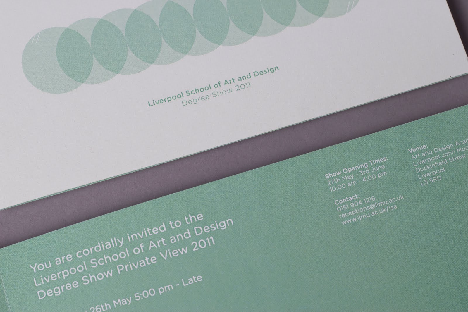
My flyer and invitation design above. I chose a neutral colour to work within the minimalistic interior of the ADA, and also to retain a colour to suit all disciplines. I created a circular identity for this years' show, involving two diagonal white lines which represent the year 2011. This identity can work alone, and does for my vinyl stickers.

The vinyl stickers have the subject names cut out of the vinyl. When placed onto windows, shaddows are cast on the floor as the sunlight shines through. Photographs to come soon!

The vinyl stickers have the subject names cut out of the vinyl. When placed onto windows, shaddows are cast on the floor as the sunlight shines through. Photographs to come soon!
Above shows screen based promotion. I designed web banners and LCD TV graphics to also help promote the event.
Friday, 25 February 2011
LSAD - Liverpool School of Art & Design Degree Show 2011

To help promote and advertise the Liverpool School of Art & Design Degree Show 2011. I am curently in the process of working on designs for the event. A typeface was produced to act as an identity almost for the academic year 2011.
My font acts as a stencil, which can allow for die-cutting as an alternative form of print. Minimalistic designs work well with the Art & Design Academy's decor. I opted for a small colour palette and one supporting font to present event information.
A sneak preview!
My font acts as a stencil, which can allow for die-cutting as an alternative form of print. Minimalistic designs work well with the Art & Design Academy's decor. I opted for a small colour palette and one supporting font to present event information.
A sneak preview!
Sunday, 12 December 2010


Subscribe to:
Comments (Atom)